Less is More: 7 Best Practices for a Minimalist Website Design

You may have noticed that more and more websites are opting for minimalist web design.
And it is not just on websites. Minimalism can also be found in interior design, architecture, digital products, and it is even a lifestyle.
What makes minimalist design work, according to Carrie Cousins, is that it employs a “distinct focus on one bit of content, without competition from other elements.” Also, it works well in a mobile-responsive environment, since there are fewer elements that you need to resize.
But before we dig deeper into minimalist design practice, it is essential that we should understand its concept first.
Minimalism: The Art of Less
Also known as the “art of less,” minimalism revolves around the ideology that less is more. It is not a new design trend. It has been around for as long as the design itself.
According to Oleg Mokhov’s history of minimalist design, minimalism’s roots can be traced back from three critical periods:
- De Stijl art movement (1917 – 1930s): De Stijl, which means “the style” in Dutch, uses lines, rectangles, white and black, and primary colors.
- Post-WWI architects such as Van Der Rohe: Uses clean lines, simple structural frameworks, and open spaces.
- Traditional Japanese Design: Uses simple and Zen elements.
Minimalism is about including elements that are only necessary for functionality. These elements are typography, color, and space. Cousins also added that “Minimalist design can be identified by a framework that is simple in nature.”
Here are seven best practices that can help you achieve minimalist web design.
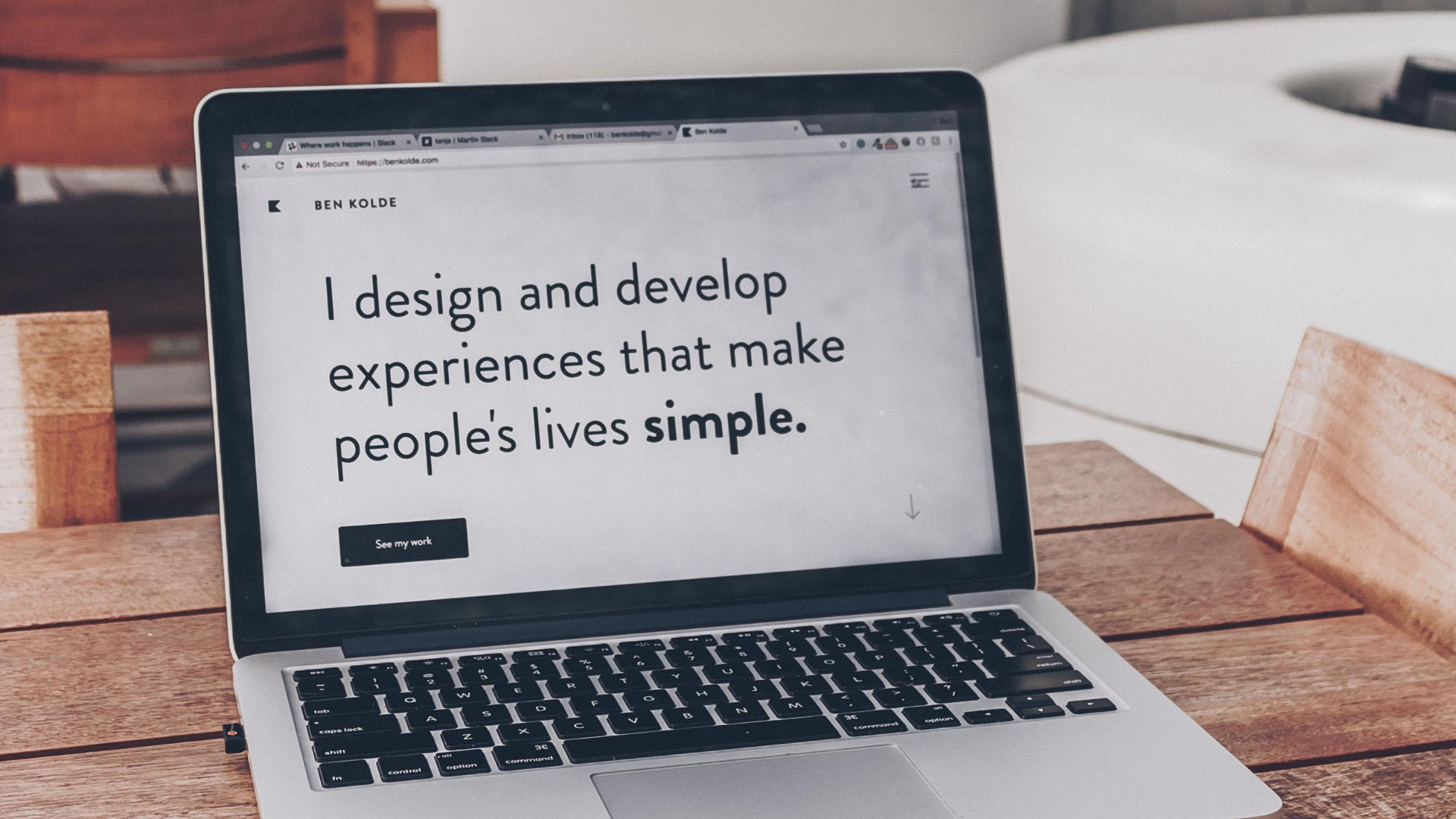
1. Leverage whitespace
Also called negative space in the design world, white space is the blank area you see between elements. However, it is the most underrated web design element.
While some see it as a waste of screen real estate, white space can be used to help your website visitors focus their attention on your content.
According to Anna Chebanova, “By being conscious about what occupies the space between your website’s main content blocks, you can make your site captivate readers, inviting them to stay longer and scroll further.”
When used well, white space can help you create and develop web design layouts that are easy on the eyes. Thus, your site visitors are encouraged to keep on consuming your content.
Simply put, using a lot of whitespaces balances your design. Thus, it improves your site visitors’ user experience.
2. Use bright colors well
Bright and bold colors are often used when your brand exudes fun and carefree spirit. However, it can be used in minimalism, although it can be tricky.
As Chebanova points out, “Vivid backgrounds call for attention and capture the user’s gaze. But too much color and the background isn’t captivating anymore ‒ it’s just irritating.”
She advises that you must use a more soothing and complementary hue to contrast with bright colors. It can be something like black or white typography over a colored background.
No to funky fonts, sharp transitions between content blocks, and complex animations.
Remember that the purpose of minimalism is to bring focus to one element. In this case, color is more than enough.
3. Be creative with your fonts
Just because you are aiming for minimalism does not mean that you can only use simple, Sans Serif fonts.
You can be as creative as you can be with fonts, as long as it is easy to read and can capture your site visitors’ attention.
Jack Poyntz, a web design company in Derry, suggests that you start off with standard typefaces.

“Your readers are more accustomed to seeing these typefaces in as much as you do. This makes your text a lot easier to read. However, if you intend to provide your site with its personality with the use of non-standard typeface, at least make sure that your choice is readable enough.”
4. Segment your information
The same with white space, text blocks help your site visitors consume your content better. It also contributes to the lightness of your website’s overall design.
According to George Armitage Miller, one of the founders of Cognitive Psychology, a human’s short-term memory can only hold seven pieces of information, plus or minus two. Meaning, we can only recall about 6 – 9 pieces of information at once.
Thus, the more information you present, the more difficult it would be to work with. In that case, it is advisable to segment your information into (preferably) five categories. Your chunks of information should not be more than nine, however.
5. Encapsulate your navigation
When it comes to minimalist design, it makes sense to remove the elements that are rarely used. However, do not go as far as eliminating important navigational links and buttons.
When it comes to your site navigation, Chebanova advises encapsulating the rest of your navigation inside the Menu button. Meanwhile, your company logo can be your Homepage button.
You also need to make sure that the navigation links and buttons are highlighted when hovered. That way, your site visitors will know that those elements are clickable.
Here is something to keep in mind when it comes to minimalist design: Unless the absence of an element can cause serious problems, feel free to get rid of it. Otherwise, if you’re using WordPress, install a 301 redirect for WordPress plugin.
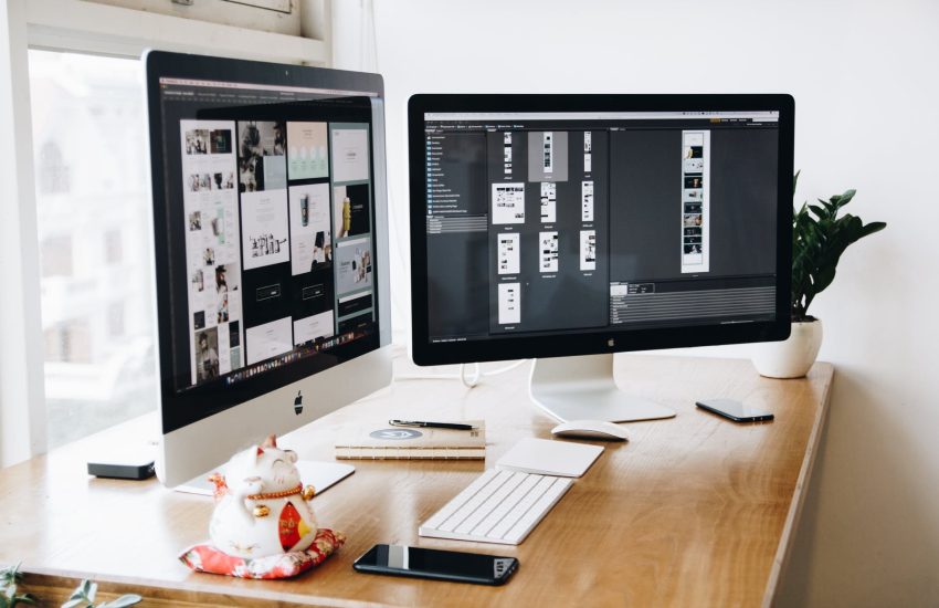
6. Use well-constructed images
There is scientific proof as to why beautiful images compel your site visitors to take action. A right image can help sell a product.
As posted on Thought Mechanics, “A well-constructed image showing the product at its best, preferably solving whatever problem it’s designed to solve will sell infinitely more than any clever description.”
No wonder e-commerce sites are image heavy!
With this, high-definition photos create an emotional connection between your content and your audience. Just keep in mind that your images should also display the products or services that you are offering.
7. Use tiny details
The reason minimalism has managed to stay current for so long is that it is adaptable.
This design principle can add tiny details on non-functional elements to attract your site visitor’s attention. This can be flying decorative signs, geometric object, and fragments you use on your web design.
Aside from adding something special on the design, these elements also help balance your content, separate it from other components, or point your site visitors’ focus towards an important message.
Small details, such as pointers, can help direct attention to your main content. However, you should remember the tiny details should not interfere with the navigation.
It’s Time to Make Minimalism Work for Your Website
Minimalist design is not going away anytime soon. That’s because it makes a website look light, and its principle leans towards improved user experience.
It may look like simple at first glance, but minimalism shifts away from content overload and bulky design. As a result, it makes your website looks light and user-friendly.
The reason minimalist design works are because it does not sacrifice usability. So, why not apply it on your website today?