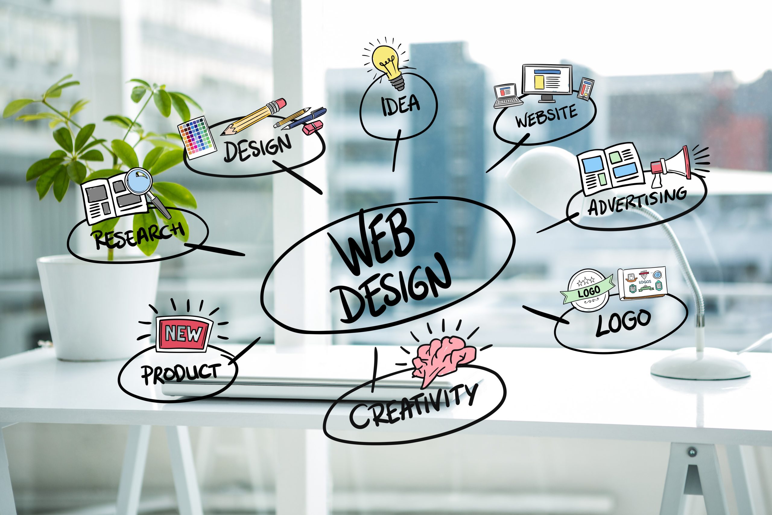
Visual Web Design Advice and Best Practices

We live in a digital world with over 1.9 billion websites on the world wide Web. There is a website available for almost anything and everything one can think of. Websites are like identities for the existence of a company. A website’s appearance plays a vital role in attracting users. Websites are like 24/7 stores that provide information to people. Web design should be done with utmost care and attention because it is something that will either make your business boom or will break it.
Websites should not only have a great visual appearance but, also high usability that draws users to your website and increases conversion rates. A good website with great visual representation and design can boost sales, increase creditability, and gain organic traffic and potential customers. A good visually designed website enhances user experience and leaves a good first impression on the users who visit your website.
In this blog, we will learn about visual web design, and how first impressions are vital to web design, and we will be discussing best practices for visual web design.
What is Visual Web Design?
Visual web design is the process of improving a website’s appearance and usability by arranging text, images, or content on your website through proper planning. Visual design is the hybrid version of UI/UX design and graphic design. You can effectively and strategically implement lines, color, contrast, or shapes that improve the aesthetic value of your website. The visual design emphasizes how good your website looks for anyone who visits it for the first time. You can enhance user experience and increase conversion rates by strategically placing visual elements (graphics, videos, or images) on your website.
How are first impressions vital for web design?
First impressions of any website are affected by various design factors like color, font, images, navigation, accessibility, and many more. It merely takes seconds to leave a first impression on the users visiting your website. To know how first impressions of your website are significant from the web design perspective, let’s check out some studies and research conducted for the same.
- Users generally take 50 milliseconds to formulate an initial opinion about a website.
- Users usually form an aesthetic judgment of your website within 17 to 50 milliseconds.
- 94% of first impressions are design-related.
A study was conducted by the Missouri University of Science and Technology that shows the time users spent on the university website when they first visited it. Here are some findings from the study:
- Logo: 6.48 sec
- Navigation Menu: 6.44 sec
- Search Box: 6+ sec
- Social Media Links: 5.95 sec
- Website Main Image: 5.94 sec
- Written Content: 5.59 sec
- Website Footer: 5.25 sec
Visual Web Design Best Practices
Let’s move forward. This section will discuss some of the best web design practices you can implement for your website.
Navigation:
Navigation plays the most crucial role in user engagement on your website. It should be simple and as organized as possible because it helps users get solutions for complex problems or access valuable and helpful content. Users should be able to quickly go through the options available in the navigation and find the information that they might be looking for.
To understand it better, let’s consider a small real-time scenario. Suppose you visit a website. There might be some questions that might pop up. Why do you visit this particular website? Are you here to buy something? Do you want to know about some offers, or are you here just for some information? How are you going to accomplish your tasks? These queries may sound simple, but conversion rates get affected if the website’s navigation is clumsy or if there are too many options available to choose from.
You can follow Hick’s Law for smooth and intuitive navigation for your website. Hick’s Law states, “The more options available to a person, the longer it will take for him or her to make a decision about which option is best.” Fewer options in your website navigation will significantly increase the conversion rates of the visitors.
There are a few parameters for designing good navigation for your website:
- Language should be clear and standard recognizable terms like About, Services, and Contact are suggested.
- Tall pages with heavy content must have detailed navigation with descriptive menus.
- You can place the navigation bar on the website header for the side-by-side listing of prominent pages.
- You can place a navigation map (search bar) for the users on the website’s footer for searching specific keywords or information.
- You should have breadcrumbs on each page for easy tracking of the user’s journey through the website.
- You should use simple headings for your navigation. You can also add drop-down menus for the sub-categories in the headings.
Clear CTAs (Call to Action):
Call to Action (CTA) is one of the most vital aspects of the web designing process. They are the specific elements on the advertisements, website content, or web pages that motivate your customer to convert. Customers can convert by making purchases, subscribing to a service, downloading the app, or booking an appointment. There are various forms of CTAs like:
- Sign up for free
- Learn more
- Contact us
- Subscribe
- Start a free trial
- Read more
The objective of a website is to attract a target audience and convert them into customers. For achieving high conversion rates you can use multiple CTAs on your website. There can be different CTAs for different landing pages. You should design CTAs that are creative and visual. You should look out for the type of typography, color, or images for your CTAs. A visually appealing CTA will encourage a customer to take action and will increase your conversion rates. Although CTAs are not related to sales, their positioning and layout in the web pages directly impact sales by converting traffic (website visitors) into sales.
Colour Scheme:
A good color scheme on a website defines its strong visual brand identity. You can improve your understanding and interaction with the content. The readability and navigation of your website enhance using a good color scheme. It helps reinforce your brand identity. Some say a website’s color scheme may depend on the type of typography used, but there is another aspect to choosing colors for your website. Many top brands choose their website colors using Human Psychology. Different colors have different psychological effects on our moods, purchasing power, and interaction with the website content. Colour schemes act as deciding factors of the course of action users might take on visiting your website. Designers can look at the color wheel and see how opposite hues blend to attract the audience to your website.
For e.g., McDonald’s has red and yellow color schemes on its website. Red is related to activeness. It increases the heart rate which helps raise our appetite. The color yellow depicts happiness. This color scheme has a specific psychological effect on people’s minds and helps the brand to convert traffic into sales.
Prioritized SEO:
Search Engine Optimization (SEO) is a simple but essential part of web design. It helps to rank your website high on the search engine ranking pages (SERPs). Search engines use targeted keywords searched by the users. You can use relevant keywords all over your website for higher placement on search engines. Keywords make your content easily accessible and help you gain organic traffic. A good SEO design consists of the labeling of pages, titles on images, and proper keyword usage throughout the content.
You may consider the following parameters for better SEO practices on your website:
- Create an XML sitemap for showing page location on the website, the relationship between different pages on the website, the update frequency of the page, and duplicate content on the website.
- Having keywords in the domain boosts SEO rankings.
- The quality of your website also affects the SEO rankings. Some important factors include the uptime of the website, SSL certificates, ‘Contact Us’ and ‘About Us’ pages, and navigation.
- You can link your website to other websites for better reach and organic traffic. The number of linking pages, quality of the linked website, and anchor text those websites use are some factors you can consider for backlinking.
Add Images:
Images are a vital part of visual web design. They help increase user engagement by making content visually informative, engaging, and memorable. As we know, people tend to remember more what they see than what they read. Adding high-quality images help people visualise more about the content than texts. They make websites look good and impressive. Images will help accumulate more views on your website and thus increase conversion rates. High-quality images decrease the bounce rate on the websites and forms link between the company and the customer.
Let us look at some of the web design practices you can use for images:

- You can use human faces featuring images to increase user engagement as these images tend to highlight emotions and empathy among users.
- You can add Alt Text to your images to provide descriptions of your pictures so that users can understand images better.
- You can use responsive images that expand or shrinks as per the browser’s size.
- You can enhance the UX of your website by adding favicons.
Visuals Elements:
The major disadvantage of having all-text websites is that they significantly affect user engagement. If you use visual elements like graphics, videos, images, animations, screenshots, memes, etc., your website becomes visually beautiful and impressive to look at. In simple terms, what visual elements are to websites is the same as the stories with pics for young kids. People tend to stay more on your websites if you have videos or infographics on the website. The longer people stay on your website, the higher the chances of them converting into potential customers or clients. Visuals enhance user experience, provide diversity to the website, improve conversions, improve performance, and decrease bounce rates.
Consistent Branding:
The foundation of any business is its branding. You should be consistent in branding across all customer channels including your website. A uniform branding process builds your brand equity and pays off the marketing team’s efforts. When a user visits your website, the landing page is the first thing they stumble upon. The landing page should be able to give a brief about your business. It should have a combination of graphics and content that tell the story of your brand, brand colour, or the industry you are related to.
The colour scheme, typography, logo, or iconography should be consistent throughout the website. You should use pre-determined taglines, logos, colours, or brand logos on the website’s pages to maintain the consistency of your brand. There are various elements of branding that you can use to promote business:
- Brand identity
- Brand image
- Brand positioning
- Brand tagline
- Brand experience
- Brand logo
Mobile-friendly:
The world has seen a constant rise in mobile usage in recent years. According to Statista, there will be around 7.6 billion mobile users by 2027. People use mobiles for everything, from accessing the internet to buying daily necessities. So optimizing your website for mobile may prove a game-changing move for your business growth. From an SEO perspective also it is profitable to use mobile-friendly websites as these websites rank higher on Google. If your website’s layout and style are not impressive enough for mobiles, then people will lose interest in your website. It will significantly impact the brand value and conversion rates. On July 1, 2019, Google rolled out its mobile-first indexing policy (by default for new websites). If you have separate URLs for desktop and mobile, then Google will show the mobile URL for mobile users and the desktop URL for desktop users. This implementation has opened new doors for mobile-friendly websites as they get more organic traffic and higher ranks in search engines. With the mobile-first design, you can optimize user experience, organize your content, or simplify the navigation. It will help in turning users into potential customers or leads.
Responsive Design:
Responsive design is a powerful weapon in the arsenal of web designers. It ensures that your website is compatible with different devices (mobiles, desktops, laptops, Macs, or tablets) of various screen sizes and browsers. Content on the responsive websites automatically resizes as per the dimensions of the device user is using. Sometimes there are certain buttons, icons, or links in the desktop version of the website that may become clumsy or difficult to operate if they shrunk to the size of a smartphone. The responsive design of the websites resolves this operational issue and makes websites feel good and work nicely irrespective of the type of the device and screen size. Responsive design enhances user experience, makes navigation easy, and increases brand value, conversions, and engagement.
Social Media Icons:
In today’s digital age, social media is one of the most amazing tools for marketing. You can gain followers and organic traffic by adding social media buttons or icons to your website. It is one of the simplest elements to design that helps increase your social visibility and reach towards potential customers. Let us understand this with an example. Suppose a person visits your website and finds some content valuable and informative. Then he will try to share that piece of information with others. If you have provided various social platforms (Twitter, Facebook, Instagram, or LinkedIn) icons, then it would be an easy-peasy task to share informative content with others. It will help increase your social media presence and gain organic traffic.
Social media platforms are a splendid source of brand promotion. You can use social media to increase conversion rates. People can connect with you on various platforms and get regular updates on your business. You can link your social media accounts to your emails, blog posts, guest posts, or other social bios.
Accessibility:
According to World Bank, 15% of the world population experience some kind of disability. It is the hour of need to design websites and applications that are accessible by all. In simple terms, accessibility is a process of creating websites and apps that people with disabilities (visual, auditory, motor, cognitive, or speech) can use. Web Accessibility Initiative and World Wide Web Consortium have developed a set of policies called Web Content Accessibility Guidelines (WCAG) for web accessibility. If you want to grow your business, you should consider web accessibility as your top priority. It will help increase organic traffic and expand your network.
Following are some parameters you can consider for better web accessibility:
- You can use contrasting colors as it is easy for people with visual impairments to view clearly.
- You can change the style of your text to bold or underlined or use different sizes and shapes for better visibility.
- You can provide keyboard navigation support for people having difficulty using a mouse.
Apart from people with disabilities, web accessibility is beneficial for the following:
- People who use small screen devices.
- Elderly people
- People who access the internet in bright sunlight or on public transport.
- People with temporary disabilities (broken limbs, lost glasses, or medical conditions).
- People have slow internet connections.
Use of Whitespace:
Whitespace is the lack of color or negative space that helps a website look less crowded and cluttered. From a design perspective, negative space is a vital aspect of the website. If the website overcrowds with graphics and content, it will leave a poor impression on the users and affect conversion rates. Whitespace is the space between elements in the form of margins, in-between graphics, or gutters. You can use a Whitespace to highlight significant aspects of your page. It will help users focus on the specifics you want them to focus on such as signing up for a newsletter, joining an event, shopping for your collection, and many more.
Whitespace makes the website appearance neat, balances visual effects, reduces visual noise, and increases the readability of the content. If there are limited graphics and text on a page, it will be easy for the visitors to connect with what’s going on and act accordingly. Whitespace helps organize the contents of your web page and diverts the users’ attention to specific or essential elements of your website.
Typography:
Typography is the arrangement and presentation of the letters and characters on a page. It generally refers to the font size and style of the text you use on your website. Typography can make your website run or break depending on the type and style of font you have used. Good typography can enhance the user experience and increase the chances of user conversions. A good typeface is easy to read, skim, accessible to all users, and readable on multiple devices.
You can consider the following parameters for the typography of your website:
- You can use 2-3 fonts for your website. One font for the logo, another for headings or menus, and another for body text.
- You can use creative fonts if it is visually appealing.
- You can keep the font size of the body text between 13 to 16 pixels.
- For headers and sub-headers use slightly large fonts.
- You should use fonts that are readable from both mobiles and desktops.
Readability:
Readability is one of the most left-out elements of web designing. Too much information on your website may cause visitors to have difficulty processing all the information and may impact your marketing goals. If the content on your website is easy to read, it will enhance the user experience. You can consider the following tips for increasing the readability of your website:
- There should be sufficient contrast between background colors and text.
- You can use simple fonts that are easy to read and skim.
- Avoid using too many fonts as it will clutter the website.
- Fonts should be of appropriate sizes, not too small nor too big.
- You can use short sentences or a combination of long and short sentences.
- You can use paragraphs to make the content look appealing.
- You can use lists and bullet points to increase the scannability of the content.
A/B Testing:
There’s a famous quote, “They say nobody is perfect”. The same goes for websites. No website is perfect. There is always room for improvement in your website. Your website needs regular updates and improvements for it to be running smoothly. Almost all the elements of your website are testable. It is where the A/B testing comes in handy. A/B test is a method in which you can check the performance of your website by comparing different versions of a website.
You can create two separate versions of your website and run the A/B test for testing various elements. Let’s take a look at some of the elements that you can start your tests with:
- You can test your navigation.
- You can test the font size of your landing page.
- You can test the images and colors on your website.
- You can test the location and color of the CTA button.
- You can test the CTA copy.
Final Thoughts
If you want to grow your business, you can design a website. But it does not mean you just create a website and leave it. Your website needs regular updates and improvements to run it smoothly. We have discussed various web design practices which you can implement to make your website visually appealing. These practices or principles will help you build a creative website with good performance, usability, and functionality. In the end, it’s the decision of the organization to choose the practices that suit them best.