Color And Its Effect On Your Logo Design – What You Should Consider
Everyone has their specific choices and taste in everything. Some people always buy the same color of belongings. For instance, if your favorite color is black and you go shopping, your hand will always reach for some shade of black, no matter how many other options you get. Likewise, when you start your own business and have to decide the logo, you know what its color would be, right? Wait.
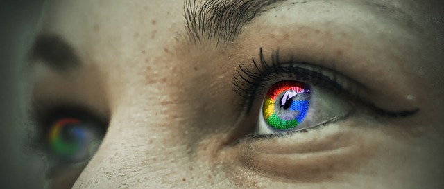
Do you ever realize that every color has a meaning and specific characteristics? Therefore, it is important to choose the right color for your logo. If you pick the colors smartly, your audience will be able to understand EXACTLY what the intended message is. By analyzing different types of logos and their colors, you can understand why a brand selects a particular color or a combination of colors for their logo.
Research conducted in the University of Loyola, Maryland reveals that focus and understanding of color in logo designing increase brand comprehension by up to 73% whereas, boosts brand recognition by 80%. A designer needs to understand the psychology of color to create a meaningful professional logo. Being a creative person, a designer should understand the precise emotion people feel as they see a specific color.
The right color helps to tell people what the brand is all about and what their objectives are. Another research shows the readership of text also increases by up to 40% because of colors. On the contrary, if the color doesn’t go with the overall theme, people won’t be able to connect with the brand.
Successful companies use colors efficiently to attract their audience towards their goods and services. It also influences the buying decision of the consumers and helps companies to figure out their target audience.
What color suits your brand depends on the tone, value, age, time and gender of the brand. It means that before choosing the color, you must understand your brand personality.
Colors and their impact
- Yellow spreads positivity
The color of the sun is yellow, and just like the way every sunrise gives you new hope and a feeling of optimism, similarly, its color yellow also evokes clarity and positivity. Moreover, as it’s a bright color, it shines out everything else and creates its unique image in people’s mind. Brands which want to bring a smile on people’s face generally use this color.
- Orange indicates confidence
You can’t ignore this color no matter what. Its striking shades stand out and send a very strong message. It’s the color of youth and also represents creativity and enthusiasm. Generally, brands use this color with other subtle colors to make it pleasing to the eyes just like Harley Davidson. Complementing orange with black and white makes any company’s logo both smart and pretty.
Kids also really like this color. That is why Nickelodeon’s has also used orange in their logo in an effective manner. Fanta is another example that used orange in the logo because of the obvious reasons.
- Red is sensual
As everyone knows, red evokes emotions and warmth. Red shows romance and excitement. This color is mostly used in the entertainment industry. Cinemas, production houses, and drama companies’ logos are generally red. Whether it’s Nintendo or Netflix, use of the color red makes it stand out. This color even in the simplest font works well to show the power and boldness of the brand.
Red also indicates urgency that is why brands like K-mart didn’t think twice to use this striking color. Coca-Cola uses this color to show positivity.
- Discover with purple
This color shows how grand a brand is. Purple gives a royal feel to the logo. It encourages you to imagine. It makes it extraordinary. Those companies that desire to send the message that they promote new ideas use this color. This one goes perfectly with the san-serif font. It embarks wisdom, and that is the reason, Hall Mark’s logo is purple.
- Blue is dependable
Have you seen the ocean? Isn’t it gives you a feeling of calm and comfort? Blue is the colors that calm you down and also gives you trust. It creates a connection with people. Blue showcases grandeur just like the sky. According to research, 42% people say that blue is their most favorite color.
There is a notion of trustworthiness attached to this color. Therefore, brands like Intel and Dell have this color in their logos. Many home appliances brands choose blue for their log because they want to prove their reliability and trust.
- Nature is green
Brands which intend to tell people that they are growing or want to promote an eco-friendly message, generously use green in their logos. Animal Planet and John Deere use green in their logo to show their connection with Mother Earth. Nature-focused companies always pick green. Food companies prefer green in their logo as well, if they promote organic food or want to associate their brand with health.
- Black and white is classy
These colors indicate professionalism. High-end brands often use different shades of black in their logo to give a sense of class and timelessness. Brands like Nike choose black to show their edgy and sporty nature. Various luxury brands like Honda and Mercedes-Benz use this killing combination to shine out their competitors. It represents elegance and simplicity. Black and white are deep and thought-provoking.
While considering different options for your logo, you should think about everything from typography, color, and curves to font size. You cannot change your logo every now and then. Your logo is your identity. The colors you choose for your logo play a very important role in setting your desired image in people’s mind. Hence, always try to make the right choice as far as the color of your logo is concerned. There is nothing wrong with experimentation if you keep in mind the intended message of your brand.

