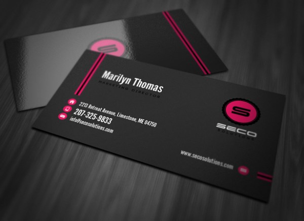
Business Card Design Tips – How To Add Marvel To Your Card’s Personality!
Business cards have become bewildering entities for the designers since the clients, themselves, do not know what message they want to convey through their business cards. With respect to their simple introductory objectives, business cards are often designed in a plain manner as the name, contact details and other information of the card owner in a casual text format. However, this small piece of paper can fulfill several purposes for the owner, if designed aptly. So to make your card ingenious enough to attract non-potential customers and clients, develop a stronger image of your company and to make it serve some other desired purpose, following tips would definitely work!

Stick To The Vision Of Your Company:
For a business card, the logo of your company cannot solely serve the purpose and vision of your company. Here, the re-conception of your company’s vision is required. For example, if your vision is to run an environment-friendly organization, then use the color tactics. White and bright green or other shades of green are ideal. If your company is associated with the stock exchange, then plain background with some bold and elegant color, like coffee brown, will go with your details embossed on the card.
Add Weight To Your Card’s Personality:
Generally, flimsy and thin cards are associated with weak personality of the company. A card with glossy surface and thick sheet always develops a stronger image of the company’s sincerity, employee’s honesty and most importantly, the insurance of satisfactory services. Plastic cards are also in fashion these days. Furthermore, utilize the back side of your business card with some more necessary details. Avoid stuffing the card with indigestible information. You can simply put your company’s one-line slogan or the picture of your Public Relations Officer or the CEO.
Avoid Over-Fashioned Or Glittering Cards:
Although the trends of business cards change from time to time and year to year, yet every new fashion cannot serve the purpose of your company. For example, the first spell of 2012 was of funky colors. However, if you are a business tycoon or an industrialist, then funky colors would produce counter effects. Glitters and sparkles are required for a few specific themes only. An owner of cosmetics company can utilize glitters, but an owner of a medical company should be repellent for such arts. Similarly, cartoons or smilies cannot work on all types of business cards.
Remember! Your business card’s personality is actually a depiction of your company’s personality. Visit http://customlogoonline.com/ – the best business cards & logo design company providing Logo design services since 2001.


